-
Directory
New items New comments Latest content Latest reviews Latest questions
Search link directory Mark read
Navigation
Install the app
How to install the app on iOS
Follow along with the video below to see how to install our site as a web app on your home screen.
Note: This feature may not be available in some browsers.
More options
You are using an out of date browser. It may not display this or other websites correctly.
You should upgrade or use an alternative browser.
You should upgrade or use an alternative browser.
Can you give a review about a logo i tried making
- Thread starter Susan06
- Start date
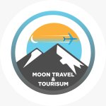
Looks good, especially the mountain ranges. I love the colour but you misspelled tourism as tourisum. All's I believe it will be better to add an 's' to the word travel.
Not so sure if I'm right about the colours. Let's wait for more experienced critics.
Not so sure if I'm right about the colours. Let's wait for more experienced critics.
everything is perfect, really good work just please correct tourisum to tourism and that's all^^

Bizdustry Advertising
In-Conversation/Thread Advertising - Click Here to Advertise
Tourism is misspelled as a lot of people have pointed out . Overall looks good
This looks good for a tourism company. I like the color combination. Everything in that logo passes an information which is very good. This is key in design. Nice work done lad
Bravo. honestly it doesn't look bad, especially when you think it comes from a beginner. I say that if you focus on this field, you would become good ")
Bizdustry Advertising
In-Conversation/Thread Advertising - Click Here to Advertise
It actually Looks really brilliant for a beginner who only learned from YouTube videos only. I think you will make a good graphic designer seeing as you only need a few corrections. You can do more editing to it to make it more clear, improve your designs, add more colour to it and you are good to go.
Yes it is a good logo but it is not much attracted so try to add scenery a beautiful place element in your logo also because it is about travel and tourism especially so add green Re or place like that it will be more attractive and will depict both of the words of your logo description so you may try it it's my opinionHi there everyone I just tried out some small tips and tricks from youtube to make a beginner logo design for my uncle's business in canada about a travel agency.
What do you think about it. Any recommendations would help so much ??
The different is very clear,if u save it don't add anything only when you add to it but in investing if you invest in some days or years to come it might grow in a high ways.is good to invest than to stock your money in the name of savings.
Bizdustry Advertising
In-Conversation/Thread Advertising - Click Here to Advertise
I think you have really out in a lot of work into this . though I will prefer only one colour in that circle, leaving it like this would not be bad at all. Good luck in your future
The log looks nice, what program did you use to draw this logo? Did you make one a logo designing tools like canva, or did you use photoshop? The logo looks too simplistic.
Honestly it looks good, the color combinations are nice and I like the concept. But then I believe you could do better just put in more effort and learn more about it. All the best.
Bizdustry Advertising
In-Conversation/Thread Advertising - Click Here to Advertise
You'd have to work or get better at colour combinations. Though you stated you're just starting and there's always room for improvements. I commend your efforts. Not everyone practicalises what is being taught or learnt
This is a good concept from you but you still need to improve on colour usage and images. I love the images though but you need to make them more catchy in your next project. All the best
Hi there everyone I just tried out some small tips and tricks from youtube to make a beginner logo design for my uncle's business in canada about a travel agency.
What do you think about it. Any recommendations would help so much ??
You actually did a very good job and there are a lot of people who cannot be able to design this kind of logo but the only mistake I see is the typographical error in your tourism so just corrected and all is good.
Bizdustry Advertising
In-Conversation/Thread Advertising - Click Here to Advertise
I think that the image is actually a beautiful one and it carries precise attention. aside from the fact that the tourism is misspelt as many people as pointed out everything is good.
Join Stash and become an investor in 2 minutes. Get the help you need to build a long term financial success.so join me online to make this money
You tried especially if you're not a graphics designer. However I'll recommend you move the words up and curve it to blend with the circle shape. Make the colour bold to stand out too. Everything else is okay.Hi there everyone I just tried out some small tips and tricks from youtube to make a beginner logo design for my uncle's business in canada about a travel agency.
What do you think about it. Any recommendations would help so much ??
Bizdustry Advertising
In-Conversation/Thread Advertising - Click Here to Advertise
Newest Directory Listings

Expand your business scale with over 200 million clean IP addresses, stellar features, and affordable prices provided by 922S5Proxy.
WWE Hub is a discussion forum for all things wrestling! Share and chat with other wrestling fans throughout the world!

ABCProxy is cost-effective, ethical residential proxies network!